Story has the power to awaken the human spirit.
First Image Films, a film and media company, develops and produces storytelling that inspires, informs, uplifts, and entertains.
As one of First Image’s co-founders, I was involved from the beginning, contributing to the naming process and leading the creation of the visual identity.
Both the name and the visual language were rooted in a single idea: light emerging from darkness. The spark of an idea before the image. The moment before the first frame.
We chose the name First Image, inspired by the origin of all thought, light, and image.
The next goal was to craft a timeless visual identity that communicates to both investors evaluating opportunity, and film enthusiasts drawn to the First Image vision.
Project Scope
Creative Direction
Naming
Logo
Visual Language System
Typography & Color
Introduction Video
Web Design
Brand Guidelines
I went to work researching and sketching. Thought is primary. Thought leads to light and light to image.
Inspired by the idea of a photon, I researched the physics of light and image. I studied how images are created and in early cinema, how moving images originated.
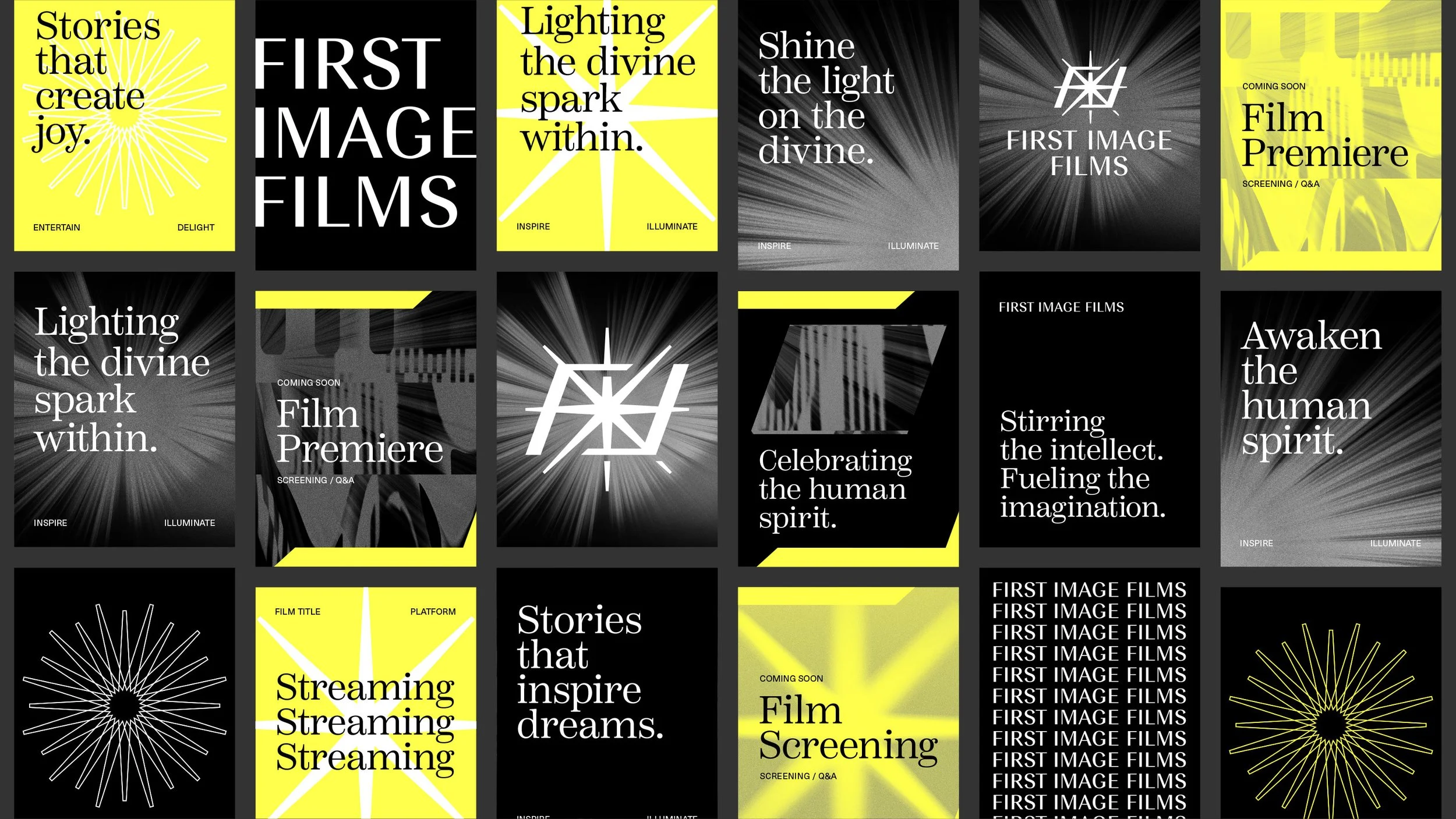
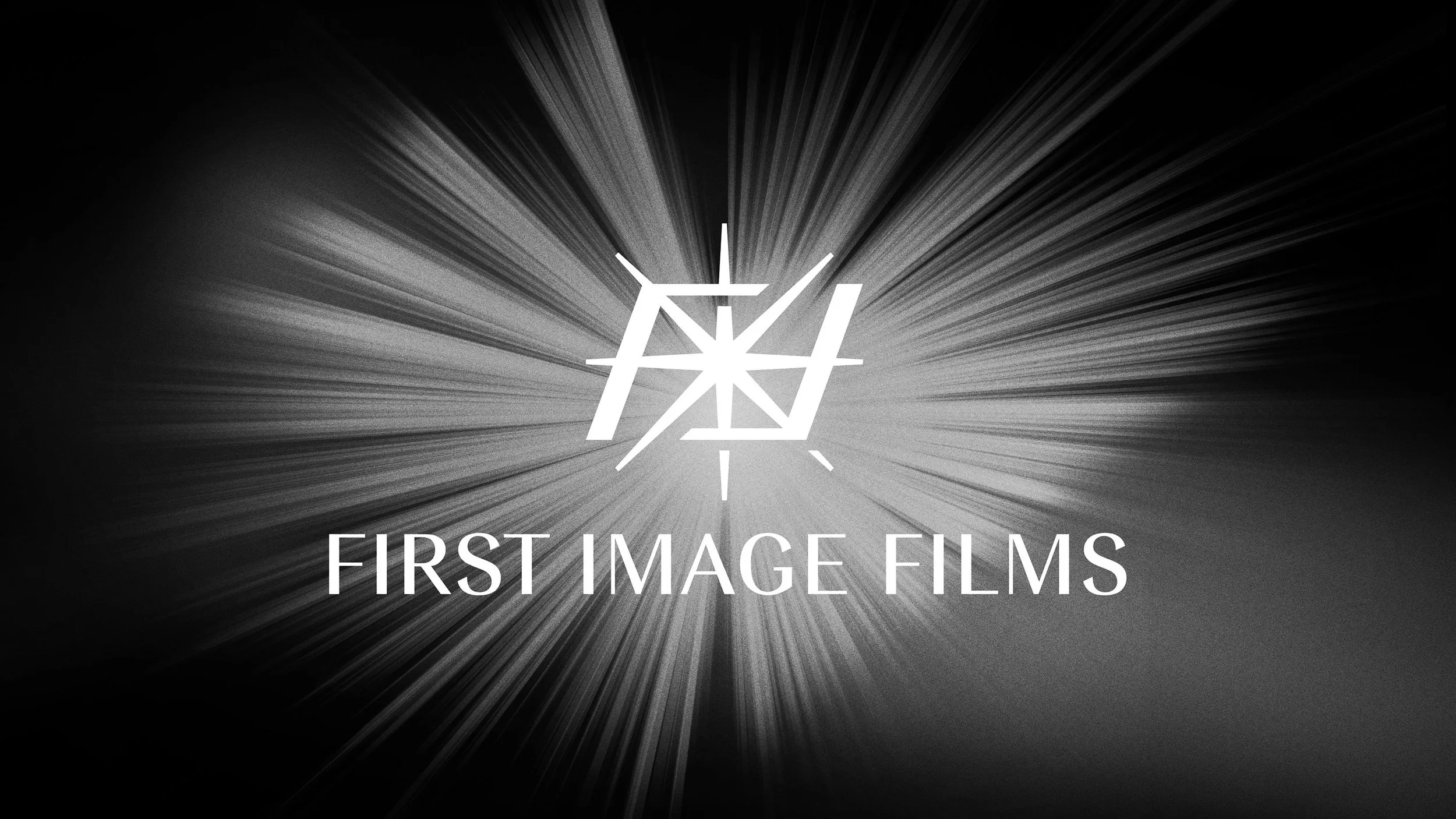
This lead to creating a logo that was pure and radiant. One that references thought, light, image and film.
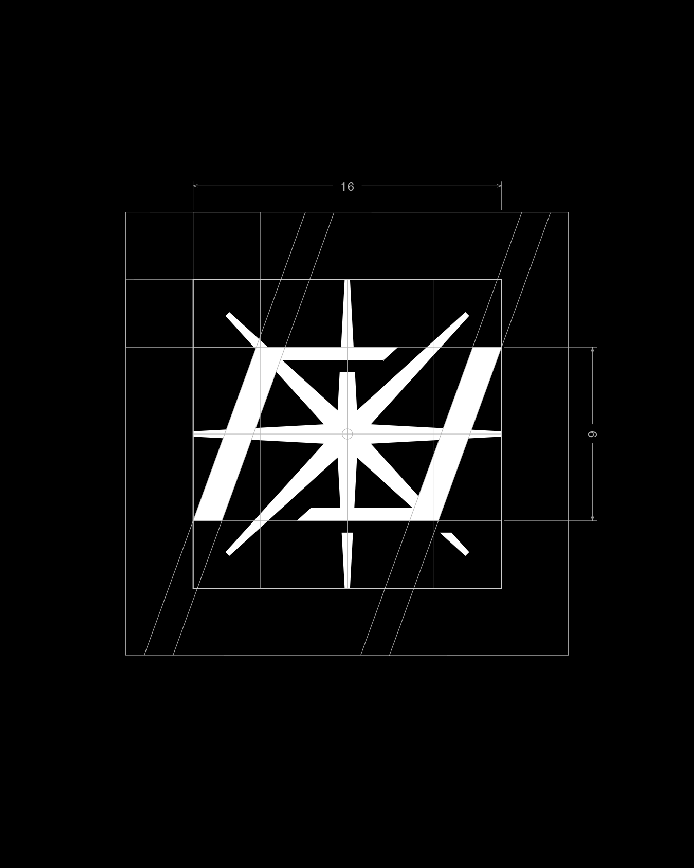
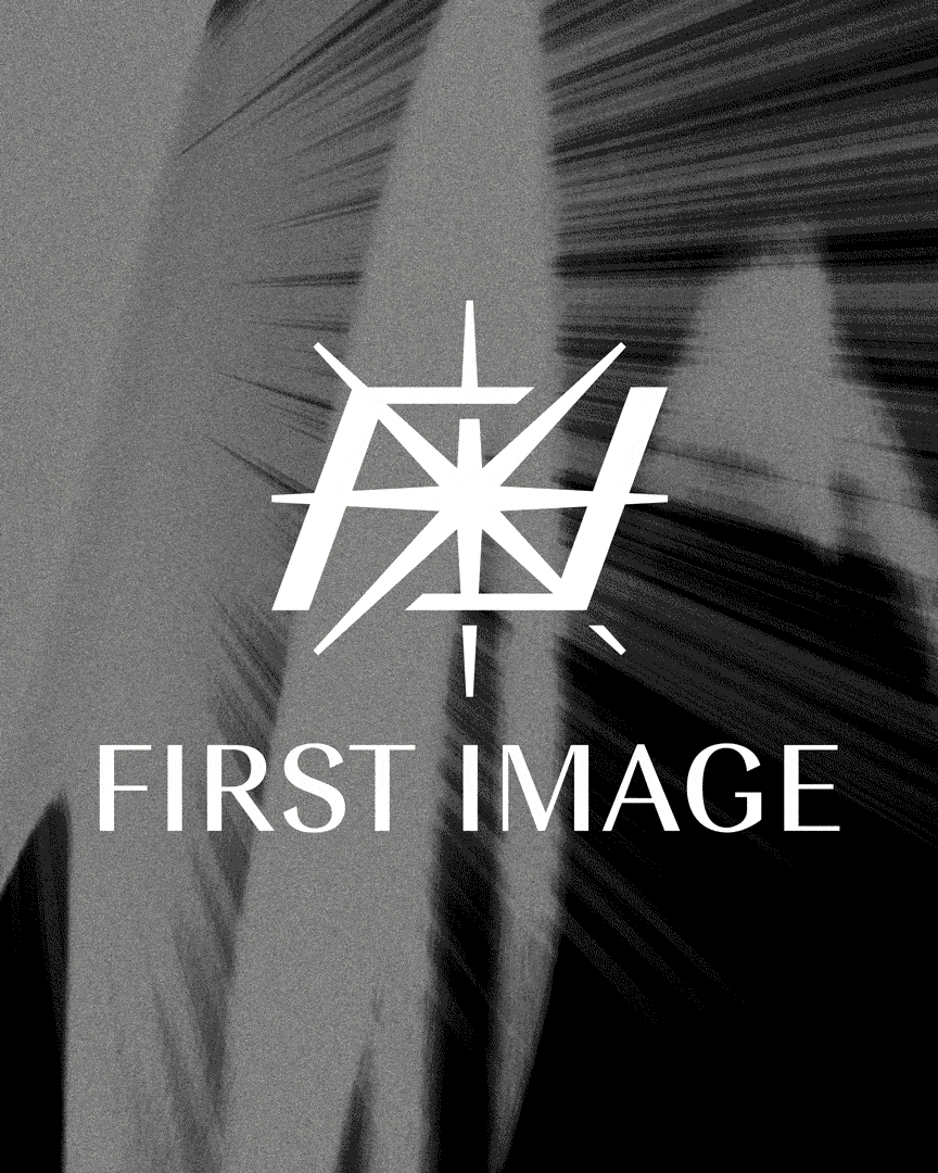
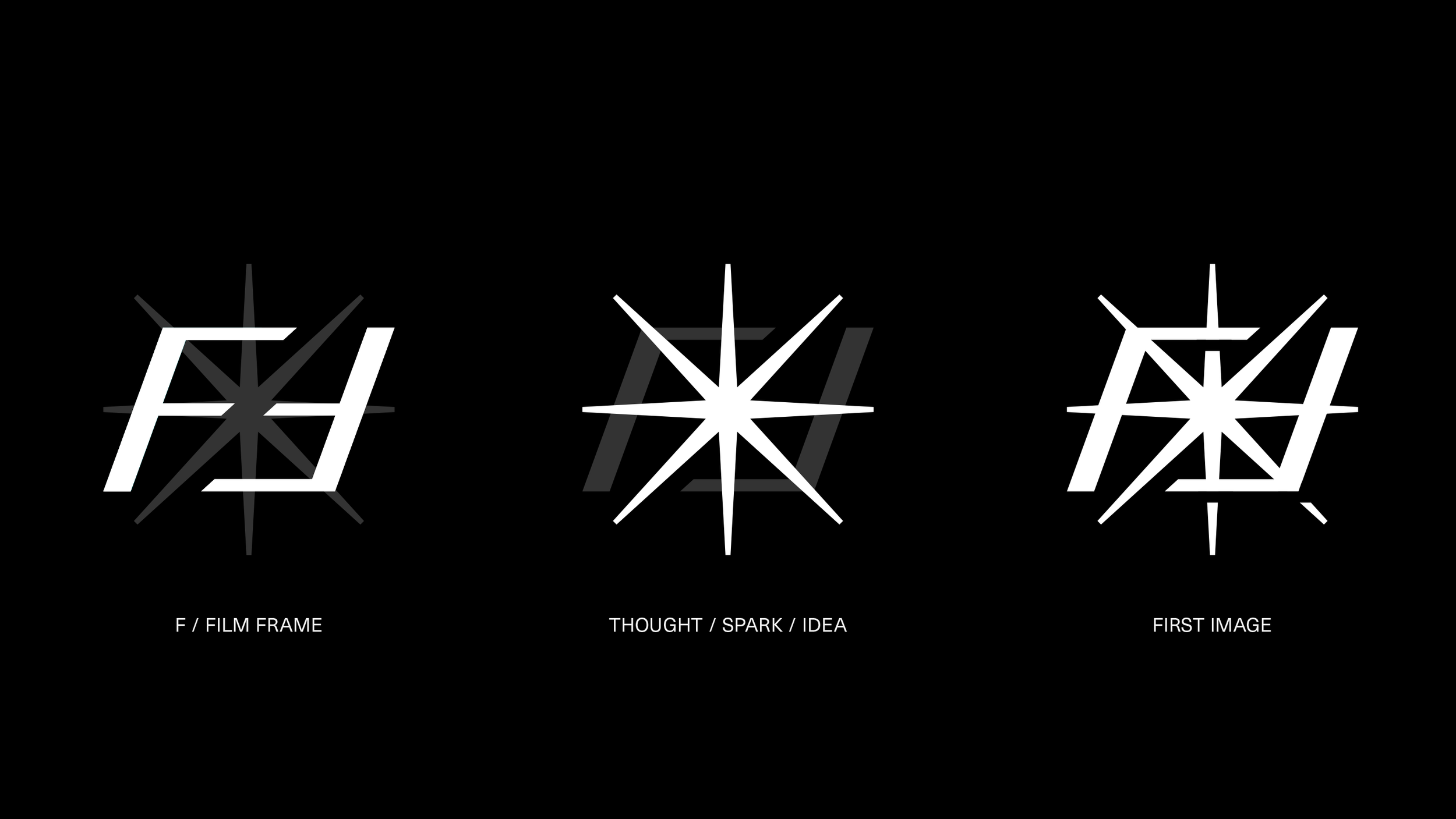
The Logo
The logo symbol combines a film frame with a radiating spark of light to form the “first image.”
The symbol is constructed from the initials FIF. The two “F”s mirror each other and converge to form a frame. The “I” spark ignites in the center, radiating into a star.
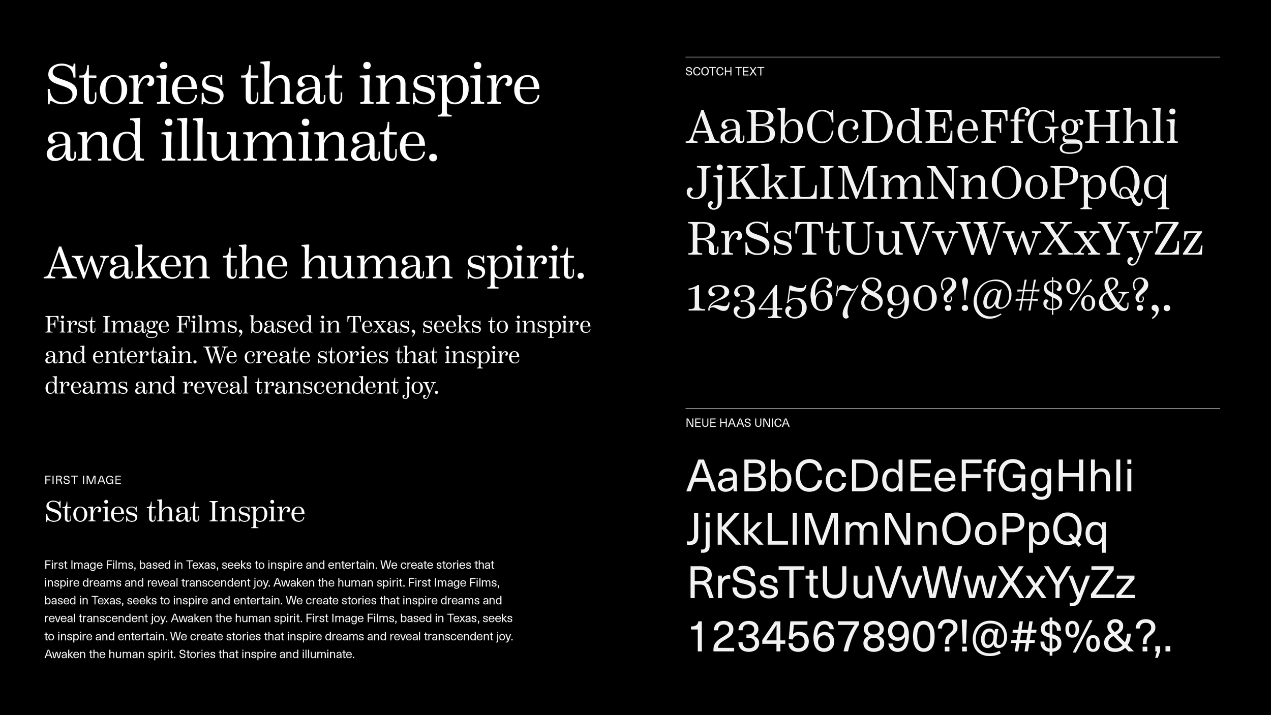
For the wordmark, I sought to compliment the symbol with type that conveyed radiance and timelessness. Type that referenced the history of cinema while maintaining a contemporary, refined aesthetic. I chose to customize the typeface Imperial, with it’s subtle vertical contrast and precise appearance.
To ensure flexibility in the long term, I created a number of different logo lockups.
Typography
To compliment the wordmark, I chose both a serif, Scotch Text, and a sans-serif, Neue Haas Unica to serve as our primary typefaces. Scotch Text is crisp, rational and is used for headings, callouts, and selective body copy. Neue Haas Unica is clean, legible, and modern, and is used for both body copy, small text, and selective headings.
Taking the cue from the wordmark, I chose a serif for headings and highlighted text and a crisp, clean sans-serif for body copy and callouts. The serif captures a traditional sense while the sans-serif anchors the identity contemporary.
Colors
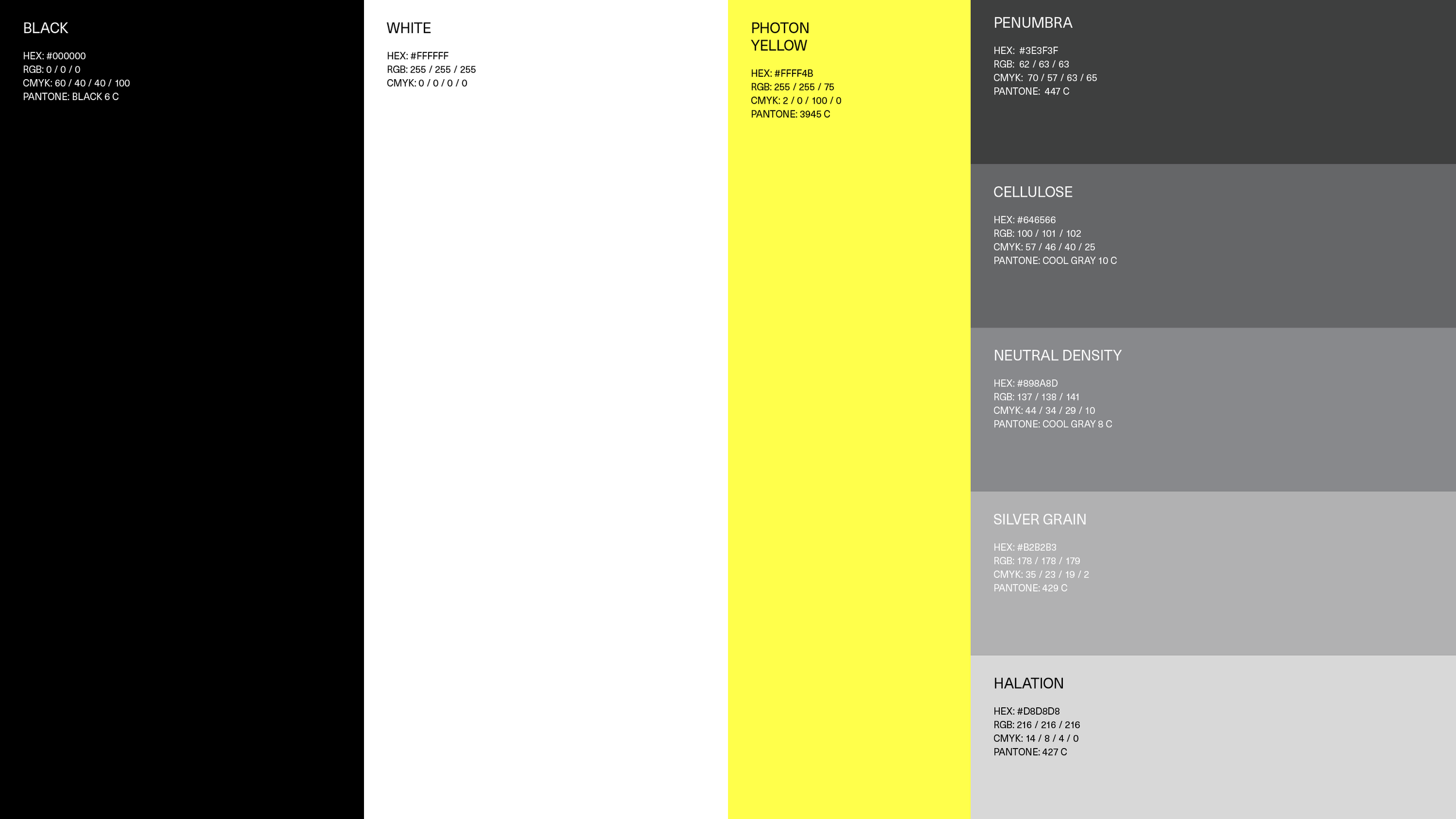
As our goal was to illustrate light emerging from darkness, I chose black and white as our primary brand colors. Pure white light emerging from pure black darkness. A vibrant yellow serves as secondary color, evoking warmth. Shades of gray round out the color palette.